
[By Nic Lindh on Wednesday, 23 November 2011]
I’d been looking for a small iPhone dock stereo for the bedroom for a while. Nothing fancy, just something to listen to podcasts and some background music while folding clothes or shaving. As you do, you know.
Doing the weekly rounds at CostCo, I saw they had the JBL On Stage (Amazon link) on sale for $60. The Amazon reviews were mostly positive so why not?
And the On Stage is just what the doctor ordered: a small, interestingly designed unit that pushes out just enough sound to be alright—kind of the underachieving little brother of a conference phone. Excellent value for the money and does the job.
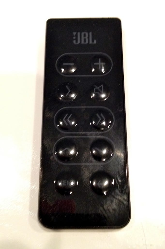
But. You knew there’d be a but, right? I doubt JBL does random drug testing among their industrial designers. Because the remote is low contrast. Take a look at the picture. It’s a black remote with grey symbols on the keys. It looks nice, sure. Kind of high-end for a piece of plastic.
The On Stage is in my bedroom. Where I don’t have floodlights. So I can’t see which key on the remote does what. In anything but perfect lighting it’s a small slab of uniform black plastic.
Please, industrial designers, white on black for remotes in the future, please? It won’t look as cool in the studio, what with it being high contrast, but people won’t curse your names when they try to turn up the volume in their bedroom. Which sounds like a double entendre but isn’t.