The Core Dump
The Core Dump is the personal blog of Nic Lindh, a Swedish-American pixel-pusher living in Phoenix, Arizona.
By Nic Lindh on Thursday, September 08, 2011 in tech · 4 min read
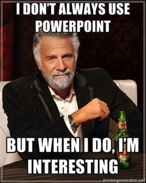
Death by PowerPoint
One of the biggest wastes of time and money in Corporate America is the crushing boredom of endless, pointless PowerPoint presentations.
How it ever became acceptable—expected, even—for a person to stand in a dim room and bore twenty other people to death while wasting their time by stretching out what would have taken 10 minutes without slides to an hour-long parade of needless details is something future sociologists will no doubt spend much time debating. But for right now, Death by PowerPoint is very real.
Fortunately, it doesn’t have to be that way.
Creating better presentations with more impact doesn’t depend on delving deep into the nooks and crannies of PowerPoint or Keynote to find the latest whiz-bang features, but rather on rethinking the way you conceive of the presentation.
If you can drop off a printout of your deck and it works just as well without you, you have not created a presentation. You have created a handout. If your audience can get your content without you there, ask yourself why am I here?
Which is not to say the solution is to make your decks impenetrable messes that require your sherpa skills to navigate. The opposite is true.
Most of the times when I lecture, there is no PowerPoint involved. I’m quite capable of getting my point across without crutches, thank-you-very-much. But sometimes you have no choice—if the culture at your company is that it’s not a serious presentation without dim lights and the soothing whir of a projector, you’re going to have to break out PowerPoint (or Keynote, if you’re lucky. Working in PowerPoint makes me feel like the regional sales manager for a Chevy dealership; working in Keynote makes me feel like an artist.)
Decks serve two—and only two—purposes:
-
Highlight key points for visual learners and hopefully keep people’s interest. Sometimes you need a chart to illustrate a point; sometimes a topical image keeps people awake.
-
Help stay on task. The bullet points help you remember the points you’re going to cover.
Which is to say, I don’t put all or even most of the material in my decks. I’m there to talk about something I know; the slides are my map to remember the material and some visuals to aid understanding. That’s all a deck should do.
But it’s not enough to build a sleek presentation. Now you have to practice it. Practice, practice, practice. I once saw a presentation where somebody had to help the presenter start PowerPoint. Really. That presentation was not off to a good start.
At a minimum you should know verbatim what you’re going to say for the first minute. Verbatim. Because the first minute is when you’re maximally nervous. Once you get up to speak, knowing exactly what you’re going to say is like having a huge snuggie blanket with you.
So, you have a great presentation and you’ve practiced it enough to make Steve Jobs envious. Now, if at all possible, run through it where you’re going to give the presentation. That room, that equipment. This is how you find out your clicker doesn’t work with the laptop in the boardroom ahead of time, that the ancient copy of PowerPoint on the presentation machine doesn’t have your fonts installed, that your gorgeous 16 by 9 layout gets squished by the steam-powered 4-by-3-only projector, and that the presentation machine doesn’t have an Internet connection so that website you are going to use to illustrate a crucial point might as well be on the moon. You find these things out ahead of time.

There’s another reason PowerPoint culture is a time and money suck for corporate America: Presentations take a lot of time to build. In the best case scenario that time is spent honing the message and plotting out the arc of the presentation. (Yes, a good presentation has an arc, just like a good movie.) But in most cases that time is spent finding cheesy clip art and clicking on every single transition effect to find The One to Rule Them All. (Hint: Pick the least obtrusive transition and stick with it.)
One of the best books written on the subject is Presentation Zen by Garr Reynolds.
It wouldn’t be fair to either Reynolds or you to attempt to rip out his ideas from the context of the book—and his ideas do need a whole gorgeous book with plenty of examples to really come through—so I’m not going to do that here. Suffice it to say that if you create presentations, you must read this book. Yes, must.
Your future audiences/hostages will thank you.
Happy presenting.
You have thoughts? Comments? Salutations? Send me an email!
Related reading you might enjoy
Small steps to avoid AI psychosis
The instinct to anthropomorphize is powerful.
Electric cars are fun, dammit
Let’s talk about how fun it is to have a go-cart people mover.
Impressions moving from an Apple Watch Series 3 to Series 5
Is there reason to upgrade from a 3 to a 5?
Renewing the nerd card: Installing Ubiquiti UniFi in the house
The Internet tells Nic to install Ubiquiti gear in his house, so he does, and now he has thoughts.
Working in the pod mines
What I wish I’d known when I started podcasting.
A report from surveillance cylinder land as we wait for HomePod
Nic reports his experiences so far with voice computing from Amazon and Google and is a bit mystified at the reaction to Apple’s HomePod.
iPhone X impressions
After a few weeks of using iPhone X I’m ready to join the congratulatory choir.
Smart homes for the wealthy
Nic is interested in smart homes. His contractor let him know how the wealthy are already using them.
Getting started with podcasting
A concise guide to getting started with podcasting, including equipment, editing, mic technique and hosting.
What to expect when you’re expecting a Hackintosh
There is unrest in the Mac community about Apple’s commitment to the platform. Some are turning their eyes to building a Hackintosh to get the kind of computer Apple doesn’t provide. Here’s what it’s like to run a Hackintosh.